EVERY version of Doctor Strange RANKED | MCU Doctor Strange SPEED-ART
Hey! I'm back, and with me, another Speed-Art. This one‘s of ol' Doctor Strange since I just released his animated evolution on my main channel and wanted to rank each one of his main looks from worst to best. So this will be mostly focusing on his appearance, but I’m sure his performance or style of animation will influence me as well. Let's get started with the worst of the worst:
24. Dr. Strange (1978)
And coming in last place is going to be both of his looks from Dr. Strange (1978) film. That’s his red cloak look as well as his blue and yellow outfit. Both these looks are just really outdated. The jewelry is too much, and the star emblem is confusing. Where did he get this star emblem idea from? So overall, it’s just outdated and not what you want doctor strange to look like.
23. The Super Hero Squad Show (2009)/ Marvel Super Hero Adventures (2019) / Trouble In Wakanda - Lego Version (2018)
At twenty-three, I’m going to lump three versions that aren’t really my favourite. That’s The Super Hero Squad Show, Marvel Super Hero Adventures, and the LEGO Marvel Super Heroes: Black Panther - Trouble in Wakanda look. The Super Hero Squad Show is basically emulating his look in the comic and what he looked like in the 90s. His appearance in both The Marvel Super Hero Adventures and Trouble In Wakanda pretty much matches his Doctor Strange 2016 look. But either way, these shows are all geared toward kids and aren’t really speaking to me.
22. Avengers Assemble (2017-2018 re-design)
And coming in at number twenty-two is Avengers Assemble, 2017-2018 re-design. This version is changed to look like the Doctor Strange 2016 film. I personally don’t like when shows redesign the characters mid-production. When the show’s already airing, it makes it very jarring to watch. And the new animation style became a lot less expressive and simplistic, which is fine but I just wasn’t really used to it. So when you watch three seasons of a show expecting a certain quality, and it suddenly changes, it throws you off and takes you out of the world you bought into.
21. Marvel Future Avengers (2017)
Next is going to be Marvel Future Avengers. It’s another look that’s basically an animated version of the 2016 movie. I’m not too crazy about these cartoons just copying Dr. Strange’s appearance in the film. Why not just be a little more creative and come up with a new design like they did in previous animated versions of the wizard?
20. Spider-Man and His Amazing Friends Version (1981-1983)
Number twenty is his Spider-Man and his Amazing Friends version. It’s fairly comic-book accurate to that period of time. He has a touch of grey hair, Eye of Agamotto used as a broach, and his cape is very exaggerated. I like his blue color scheme and his comic chest symbol. And I don’t really love the animation style for the show, but as far as the suit goes, it’s passable.
19. Marvel Disk Wars (2014)
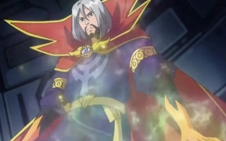
And coming in nineteenth is going to be his Marvel Disk Wars versions, which appeared before the 2016 movie, so you kind of get a weirder design here. He has the artfully blended gloves like he does in the Ultimate Spider-Man show, but also has a mane of long grey hair. It’s an interesting look for him that I don’t necessarily love, but at least it’s something different, and I’m kind of glad they went with it.
18. The Incredible Hulk (1996-1997)
Eighteen is his look from the 1990s The Incredible Hulk. It’s a very simplified design. He wears short orange gloves and has his first televised goatee, which doesn’t really add to his character but is a nice touch.
17. Dr. Mordid (1992)
And coming in number seventeen is going Doctor Mordrid, his technically second live-action version. This is a simple blue outfit with a yellow-lined cape. I think I mostly like it because it’s played by Jeffrey Combs, who played the re-animator in the trilogy. Despite it not being a great movie, he does a decent job as Dr. Mordid. Plus, the movie is an interesting little piece of history if you want to check it out.
16. Marvel’s Spider-Man (2017-2020)
Number sixteen is going to be his design in Marvel’s Spider-Man. It does look like the Benedict Cumberbatch Doctor Strange, but he’s a little more dad-like here. This version is higher on the list than the other Cumberbatch copies because he becomes venomized. He’s an awesome-looking venomized character, and Venom with Doctor Strange powers is an unstoppable monster.
15. Spider-Man TAS (1994-1998)
Coming in number fifteen is going to be his look in Spider-Man: The Animated Series from the 1990s. This has his purple shirt, yellow gloves, and tight black pants, which he also wears in his earlier versions. He’s very beefy, which is unnecessary for Doctor Strange’s character, but despite that, I still like this design quite a bit. Not to mention, this was the first appearance of his third eye.
14. X-Men TAS (1992-1997)
Next is his look in the X-Men: The Animated Series. This was a non-speaking cameo. And although it looked pretty similar to Spider-Man: The Animated Series, the cape is pointed up, and there are extra yellow patterns on the edges. Even though he doesn’t do much in these episodes, it’s still a cool look.
13. The Sorcerer Surpeme (2007) / Planet Hulk (2010)
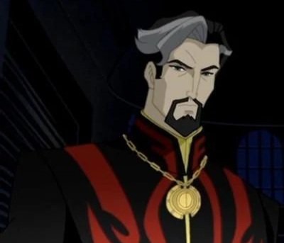
And thirteen is going to be his look from his 2007 animated movie, Doctor Strange: The Sorcerer Supreme. This look mostly gives him an overcoat instead of a tunic. It’s a red and black colour scheme with a little bit of blue on the shirt. For the most part, I like what they did with his look here.
And I’m just going to lump his 2010, Planet Hulk looks in here as well. They didn’t really change much of his look in this non-speaking cameo role. They just exaggerated the cloak a little bit. If I were to rank that one separately, it would probably be a little lower on the list, but it’s not really important enough since he’s only there for a brief moment.
12. Hulk and the Agents of S.M.A.S.H. (2013-2015)
At number twelve is going to be Hulk and the Agents of S.M.A.S.H. He has a brief appearance in that show, and it’s basically the same as his Ultimate Spider-Man look. It is, however, a much brighter colour scheme which takes away from the original Ultimate Spider-Man look. It’s still a good design, but the new colour scheme doesn’t really work for me.
11. No Way Home (2021)
At number 11 it’s going to be his wintery look in Spider-Man: No Way Home. It’s just him wearing comfy loungewear, but it’s a fun little design. It was interesting to see in the trailer because I had no idea why he would be wearing that outfit. And you don’t really see him wearing his cape with his other outfits, so it seemed unique.
10. Supreme Strange - Doctor Strange In The Multiverse of Madness (2022)
And coming into the top ten is going to be his Supreme Strange look from Doctor Strange In The Multiverse of Madness. This is an all-blue and silver outfit which you don’t really get an amazing look at in the film. There’s a brief flashback scene, along with a statue of him wearing the cape. But for the most part, you don’t see too much of his outfit, which is one of the reasons it’s lower on my list as far as the live-action versions go. They did, however, do a good job of creating a different look for Doctor Strange altogether to sell us on the Multiverse.
9. Sinister - Doctor Strange In The Multiverse of Madness (2022)
Next up is Sinister, another Doctor Strange In The Multiverse of Madness look. This is basically the same outfit he wears in the 2016 film, but just a little dirtier along with brown patches on the shoulder. I like that his goatee is grown out, his hair is a little bit longer, his face is a little more gaunt, and he’s a little paler. And I do like that he’s able to fight another version of himself in this film.
8. Ultimate Spider-Man / Avengers Assemble (2012-2015 OG version)
At number eight isn’t going to be his Ultimate Spider-Man / Avengers Assemble appearance. For the most part, I like this look. He has a black and red colour scheme, and his long hair is a different look for him for sure. This is before the 2016 film came out, and doctor strange wasn’t an extremely established character, so they were able to mess around with the design a bit more. It may not work for everybody, but I think it’s an interesting look.
7. Hulk: Where Monsters Dwell (2016)
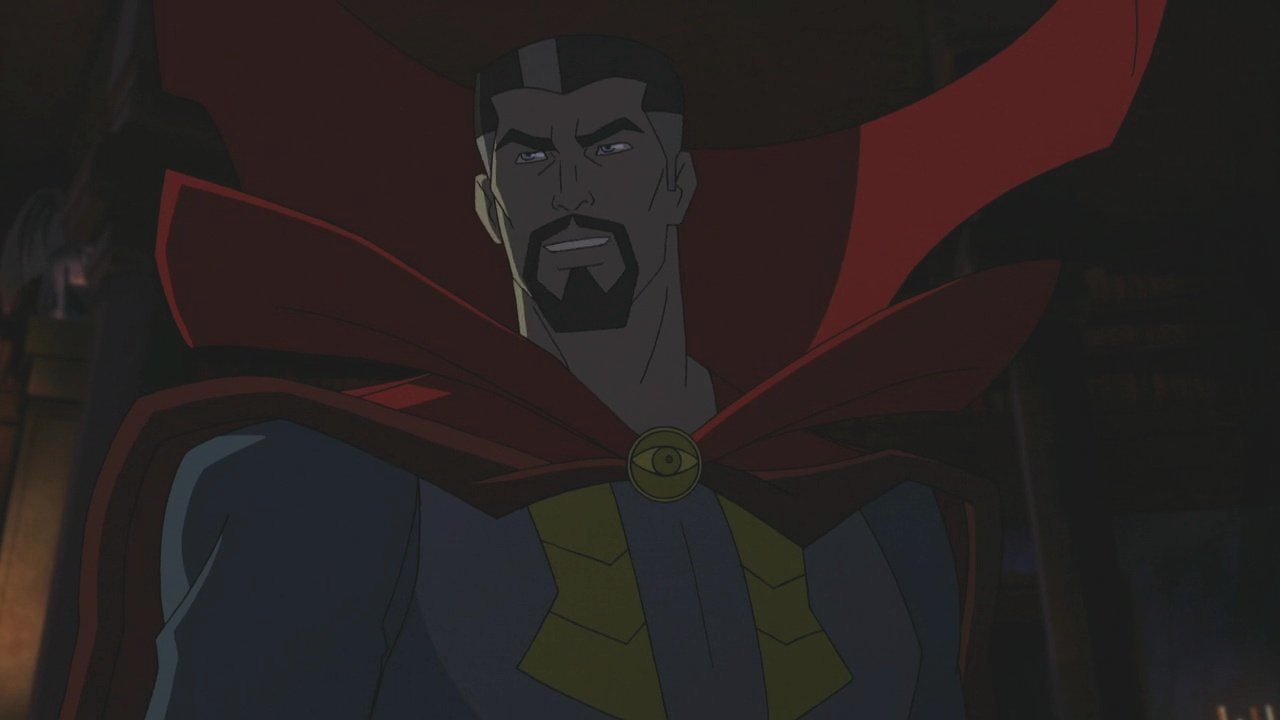
And coming in at lucky number seven is his Hulk: Where Monsters Dwell look. This is a very sleek look for him. I don’t know if they got wind of what Benedict Cumberbatch was going to look like in the live-action movie because they kind of redesigned his ultimate Spider-Man look here. Although, the collar is way more exaggerated, and he has these sleeker accents on his suit. The suit has a brighter colour scheme, minus the darker blue. For the most part, I like this design quite a bit, and it’s probably my favourite within the Ultimate Spider-Man universe as far as Doctor Strange goes.
6. Doctor Strange (2016) / Infinity War (2018) / Endgame (2019) / Spider-Man: No Way Home (2022)
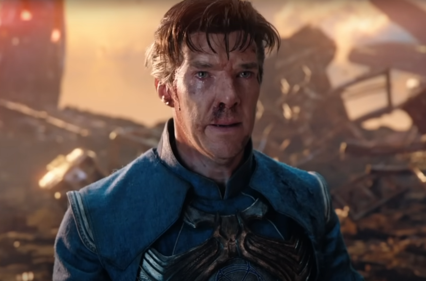
And coming in number six is going to be his look in his 2016 Doctor Strange film, which is then used again in Avengers: Infinity War, Avengers: Endgame, as well as Spider-Man: No Way Home. This has become a pretty classic look for him. It was just one of the better interpretations of a Marvel character from comic to screen. You get the blue tunic, they add in some cloth treading on his gauntlets as well as his boots, the bulky belt is a nice addition, and the Eye of Agamotto as a neckless is kind of cool. Not to mention, the cloak itself is given an extreme amount of love and care, especially in its personality. And Benedict Cumberbatch does an amazing job in this role. You really can’t get a better live-action interpretation of a comic-book character.
5. Thor: Ragnarok (2017)
And rounding out the top five is going to be his look in Thor: Ragnarok, which updates his tunic and makes it a bit tighter yet bulkier in the chest. His gauntlet threading is more colourful, his belt is redder, and he has his comic-accurate gloves. I was annoyed that they got rid of these changes in Infinity War, but I guess they wanted the look to be a bit more serious again, so they went back on the design. I just hope they bring back the yellow gloves at some point. But anyways, I love Thor: Ragnarok, and I love this design for Doctor Strange.
4. Defender - Doctor Strange In The Multiverse of Madness (2022)
And coming in at number four is going to be his Defender Strange look from Doctor Strange In The Multiverse of Madness. Now, in case it wasn’t obvious, I’m a huge fan of the red and black colour schemes. I think I mentioned it a few times in this list. I like this look. It has a hint of gold accents on the side, which is neat. And he wears a ponytail, which looks a little bit odd on Cumberbatch, but the suit is a cool sleek design. You just get a very different interpretation of him here through the multiverse.
3. What If (2021)
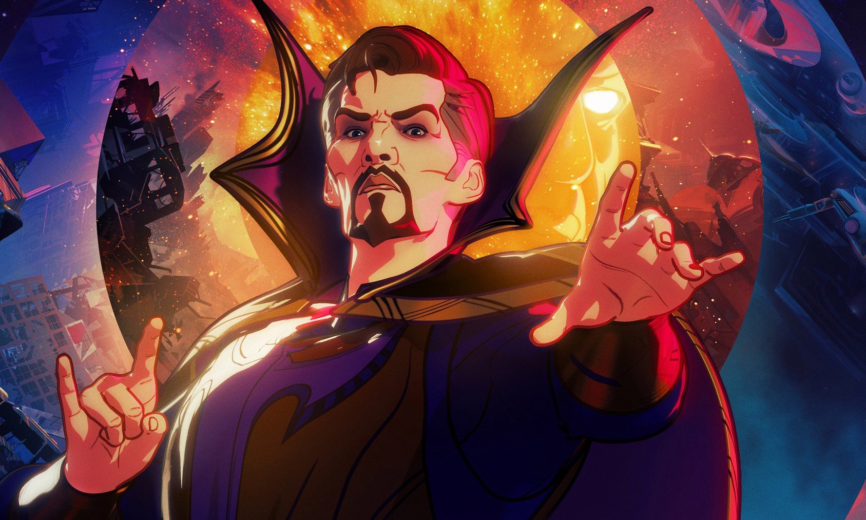
Coming at number three is his evil Strange design in What If. This look has his comic chest symbol, gold accents, dark blue sleeves and purple cape. It’s a really cool design, and he has this gaunt, pale look with a pointer goatee. He looks really evil and sickly, and I really like what they did with this design.
2. Undead - Doctor Strange In The Multiverse of Madness (2022)
At number two it’s his undead look in Doctor Strange In The Multiverse of Madness. This is his Defender Strange look, undead, being controlled by our Doctor Strange. I really like this interpretation here. It’s very Ash Williams from Army of Darkness. I like the practical effect they used to make him look like a zombie, having his face rot away and his facial hair fall off. Everything they’re doing here works really well.
1. New Suit - Doctor Strange In The Multiverse of Madness (2022)
And coming in at number one is going to be his main look in Doctor Strange In The Multiverse of Madness. This look takes some of the elements from Thor: Ragnarok and brings them to a whole new level. He has the chest symbol on his tunic, which is more fitted. He wears leather instead of cloth threaded gloves, has a tighter belt, and wears longer, darker boots. I just really like this design, and Sam Raimi did a great job directing Cumberbatch in this role.
So that is my ranking of every version of Doctor Strange. If you have any thoughts on the Doctor, feel free to comment on this video. And if you haven't seen it, check out Doctor Strange's Evolution on Tell It Animated. And until next time, I've been Aaron, and I'll tell you something...later!


